CSS
## 内部样式表
`<style> </style>`用来设置CSS单网页的
## 外部样式表
```HTML
<link rel="stylesheet" href="/样式.css">
```
## 行内样式表
```HTML
<div style="color:red; width:10px;"></div>
```
## 基础选择器
```
/*--------------------↓标签选择器↓-----------------------------------*/
div {
color:red;
}
/*---------------------↓类选择器↓------------------------------------*/
.sex {
color: red; color设置颜色 支持颜色英语,十六进制颜色,RGB
三种写法
}
.font-size {
font-size: 28px;
}
<div class="sex font-size"> </div>
/*---------------------↓ID选择器↓-----------------------------------*/
// 一般都是给js用的,方便绑定,禁止重复调用,保障唯一性
#sex {
color:red;
}
<div id="sex"> </div>
/*-------------------↓通配符选择器,选择有所标签↓----------------------*/
* {
color:red;
}
```
## 字体的设置与属性 (font)
```
.font{字体倾斜,字体粗细,字体大小,字体设置}
.font{
字体倾斜 font-style: {normal} 正常 {italic} 倾斜
字体粗细 font-weight: 100; 填入数字100-900或者英文 {normal} 正常,默认400 {bold} 加粗,默认700
字体大小 font-size: 100px; 填入数字设置大小,单位px,em
字体设置 font-family: "宋体", "微软雅黑"; 按照字体名字填写,支持设置多个字体(防止没有),浏览器会按先后顺序查找,查到到第一个为字体,后续不设置(仅设置找到的第一个,其他为兼容性查找)
}
```
## 连写方法
```
.font{
font: noraml 100 100px "宋体";
//font: 字体倾斜 粗细 字号 字体;
}
/*--------------↓字体连写方法↓---------------------*/
p { font: italic 400 25px/2 "粗体"}
选择器{font:[style]设置字体倾斜 [weight]设置字体粗细 [size]设置字体大小 [family]设置字体}
/*注意,注意*/
1.字体连写是有顺序的,不能随意换位置
2.其中字号和字体必须同时出现
3.字体大小/后面是填写行高{line-height}
```
## 文字的设置与属性 (text)
```
.text{
文字行间距 line-height: 10px; 单位(px),也支持纯数字(当前标签文字大小的倍数)
1.行高等于盒子高度,则垂直居中
2.行高小于盒子高度,则文字偏上
3.行高大于盒子高度,则文字偏下
文字对齐方式 text-align:center; {center} {left} {right}
文字首行缩进 text-indent:2em; 设置几em就是几个空格(根据字体大小变)
文字装饰 text-decoration:none;
* {none} 取消文本所有装饰
* {underline} 文本下划线
* {overline} 文本上划线
* {line-through} 删除线
* {blink} 文字闪烁
}
```
## 复合选择器
```
/*--------------↓后代选择器↓---------------------*/
<body>
<div>
<p> </p>
</div>
</body>
div p {
color:red;
}
div .red{
color:red;
}
/*--------------↓子代选择器↓---------------------*/
<body>
<div>
<p>选择这里</p>
</div>
<div>
<span><p>不会选择这里</p></span>
</div>
</body>
div>p{ //子代选择器,只选择儿子,孙子辈以后的都不选择
color:red;
}
/*--------------↓交集选择器↓---------------------*/
<body>
<div>
<p class="red">选择这里</p>
</div>
<span>
<p class="red">不选择这里</p>
</span>
</body> // 没有给空格,后代有空格,筛选必须全部符合条件的控件
div.red{ // 交集选择器,同时选择该元素的两个条件或者多个条件
color:red;
}
/*--------------↓并集选择器↓---------------------*/
<body>
<p></p>
<span></span>
<div></div>
</body>
p,span,div{ // 并集选择器,多个一起选择 用(,)逗号隔开 [和]的意思
color:red;
}
/*--------------↓伪类选择器↓---------------------*/
a:link{ //链接访问前
color:red;
}
.red:visited{ //链接访问后
color:blue;
}
div:hover{ //鼠标悬停
color:orange;
}
span:active{ //点击时(激活)
color:pink;
}
/*注意*/
四个有先后顺序,按照先后顺序使用过
[其实就是CSS类型的事件触发]
```
background-color 背景颜色
background-image 背景图片
## 元素的显示模式
<font color="#dd0000">HTML标签分为:</font>块元素、行内元素
<font color="#dd0000">块元素:</font>通常会独占一行和多行,可以设置高度、宽度、对齐等属性
<font color="#dd0000">快元素标签常见:</font>`<h1>、<p>、<div>、<ul>、<ol>、<li>`
<font color="#dd0000">行内元素:</font>不占独立区域,仅支持字体大小和图像尺寸控制区域大小,一般不支持设置宽、高、对齐等
<font color="#dd0000">行内元素标签:</font>`<a>、<strong>、<b>、<em>、<i>、<del>、<s>、<ins>、<u>、<span>`
<font color="#dd0000">行内块元素:</font>`<img /><input /><td>`
display:inline; 把块元素转换为行内元素
display:block; 把行内元素转为块元素
display:inline-block; 把行内元素转化为行内块元素
## CSS三大特性
1.<font color="#dd0000">CSS层叠型</font> 相同的属性,后面覆盖前面的------不相同的属性,不会覆盖前面的
2.<font color="#dd0000">CSS继承性</font> `font line text color`四种类型会被子元素继承
3.<font color="#dd0000">CSS优先级</font> 权重有叠加性
| 代码 | 权重 |
| ------ | ------------------------------ |
| `*{}` | 通配符选择器(0,0,0,0) |
| `div{}` | 标签选择器(0,0,0,1) |
| `.class{}` | class类选择器(0,0,1,0) |
| `#id{}` | ID(0,1,0,0) |
| `<div style="color:red;"></div>` | 行内样式(1,0,0,0) |
| `div{color:pink!important;}` | !important(最高权限) |
4.<font color="#dd0000">CSS特殊性</font>
## Emmet语法
Emmet写法:代码的简写方式,输入缩写VS code 会自动生成对应的代码
| 属性 | 标签结构 | Emmet |
| ------ | ------------------------------ | --------------- |
| 类选择器 | `<div class="box"></div>` | 标签名.类名 |
| id 选择器 | `<div id="box"></div>` | 标签名#id名 |
| 同级标签 | `<div></div><p></p>` | div+p |
| 父子级标签 | `<div><p></p></div>` | div>p |
| 多个相同标签 | `<span>l</span><span>2</span><span>3</span>` | span*3 |
| 有内容的标签 | `<div>内容</div>` | div{内容} |
| 属性 | CSS属性 | Emmet |
| ------ | ------------------------------ | --------------- |
| 宽度 | `width` | w |
| 宽度500px | `width:500px;` | w500 |
| 背景色 | `background-color` | bgc |
| 多个属性 | `width:200px;height:100px;background-color:#fff;` | w200+h100+bgc |
## CSS背景 (background)
连写:背景颜色 背景图片地址 背景平铺方式 背景滚动 背景位置
```
.bg{
背景图片 background-image:url(a.jpg);
背景平铺 background-repeat:repeat;
背景位置 background-position:center 200px;
背景位置 background-position:100px -100px; x y 两个坐标
背景固定滚动 background-attachment:fixed; //fixed 固定 scroll滚动
背景透明 background:rgba(100,100,100,0.1) 0-1之间的小数代表透明度
}
```
| **属性** | 含义 | 备注 |
| ----------------- | ------------------- |------------------- |
| background-color | 背景色 | rgba(红,黄,蓝,透明度 值 0--1 ) |
| background-image | 背景图片 | 不是用src是用url来获取图片地址 |
| background-repeat | 背景平铺方式 | {repeat}默认 {no-repeat}不平铺 <br/>{repeat-x}横向上平铺 (repeat-y)纵向平铺 <br/><br/>background-position:center bottom; 顺序不分前后<br/>如果只赋予一个值,那第二个值,默认居中,也可以赋予两个px值,<br/>用来设置左和上的间距(有顺序,左,上) |
| background-position | 背景位置 | {center} 居中 {left}左 {right}右 {top}上 {bottom}下 |
| background-attachment | 背景固定/滚动 | 默认:{scroll}滚动 {fixed}固定 |
| background-size | 背景图大小 | {cover}自适应缩放 {contain}等比例缩放 <br/>百分比:根据盒子尺寸计算图片大小<br/>数字+单位(例如:px) |
## 结构伪类选择器
| **选择器** | 含义 |
| ----------------- | ------------------- |
| E:first-child | 匹配父元素中的第一个子元素E |
| E:last-child | 匹配父元素中最后一个E元素 |
| E:nth-child(N) | 匹配父元素中第N个子元素E(第一个元素N值为1) |
| E:first-of-type | 指定类型E的第一个 |
| E:last-of-type | 指定类型E的最后一个 |
| E:nth-of-type(n) | 指定类型E的第n个 |
## 伪元素选择器
| **选择器** | 含义 |
| ----------------- | ------------------- |
| ::before | 在元素内部前面插入内容 |
| ::after | 在元素内部的后面插入内容 |
1. 必须设置content:" "属性,用来设置伪元素的内容,如果没有内容,则引号留空即可
2. 伪元素默认是行内显示模式
3. 权重和标签选择器相同
## 盒子模型
作用:布局网页,摆放盒子和内容。
* 内容区域 – width & height
* 内边距 – padding(出现在内容与盒子边缘之间)
* 边框线 – border
* 外边距 – margin(出现在盒子外面)
## 内边距 (padding)
| **说明** | 含义 |
| ----------------- | ------------------- |
| padding | 设置内边距,padding会撑开带有高和宽的盒子 |
| padding-left | 设置左边内边距 |
| padding-right | 设置右边内边距 |
| padding-botton | 设置下边内边距 |
| padding-top | 设置上边内边距 |
```
例子(padding:10px 20px)第一个值上下,第二个值左右
例子(padding:10px 20px 30px)上 左右 下
例子(padding:10px 20px 30px 40px)上 右 下 左
```
## 外边距 (margin)
| **属性** | 含义 |
| ----------------- | ------------------- |
| margin | 设置外边距 ,外边距的使用方法和内边距的使用方法一致 |
| margin-top | 设置上外边距 |
| margin-right | 设置右外边距 |
| margin-bottom | 设置下外边距 |
| margin-left | 设置左外边距 |
| margin:0 auto; | 自动水平居中对齐<br/> auto 就是自动充满,只有左右 有固定宽度 块元素 管用,上下无效|
1. 行内和行内块元素水平居中对齐,给块级的父元素添加 text-align:center;
2. 块级元素水平居中对齐: 让盒子的`左右外边距`设置为 auto 就可以了。 margin: auto;
- 小米 margin-left: auto; margin-right: auto;
- 京东/淘宝: margin: 0 auto;
## 尺寸计算
>i 默认情况:盒子尺寸 = 内容尺寸 + border 尺寸 + 内边距尺寸
结论:给盒子加 border / padding 会撑大盒子
解决:
* 手动做减法,减掉 border / padding 的尺寸
* 內减模式:**box-sizing: border-box**
## 边框的样式 (border)
```
div{
border-width:2px;
border-style:solid; //点状:dotted 实线:solid 双线:double 虚线:dashed
border-color:red;
border:2px solid red; // 连写格式
border:none; // 四个边框线取消掉样式
border-collapse:collapse; // 两个单元格的相邻边框重叠是两条线相加,显的太粗,这个可以取消掉,只显示一条
}
div{ // 四个边的格式,只需要修改top为其他边
border-top-width:2px;
border-top-style:dotted;
border-top-color:blue;
border-top:2px dotted blue;
}
```
| **属性** | 含义 | 备注 |
| ----------------- | ------------------- |------------------- |
| border-width | 边框的宽度 | 单位(px) |
| border-style | 边框的样式 | 样式:{dotted}点状线 {solid}实线 <br/> {double}双线 {dashed}虚线 |
| border-color | 边框的颜色 | |
| border-bottom | 下边框 | |
| border-top | 上边框 | |
| border-left | 左边框 | |
| border-right | 右边框 | |
| border-collapse:collapse; | 让边框重叠,显示一条线 | |
```
*{ // 清楚内外边距
margin:0;
padding:0;
}
*{padding:0; margin:0;}清除内边距,清除外边距
相邻块元素垂直外边距的合并
.wai{ // 最终间隔是100px;以两者之间的最大值为准,并不是相加
width:100px;
height:100px;
margin-buttom:100px;
}
.nei{
width:100px;
height:100px;
margin-top:50px;
}
<div class="wai"> </div>
<div class="nei"> </div>
边框的合并,如果有两个盒子,1盒子下外边距给100px,2给上边距50px,边距以最大的为准,那么就是1盒子,如果2大就是2盒子,谁大,谁就占主导地位
```
## 清除默认样式
```
/* 清除默认内外边距 */
* {
margin: 0;
padding: 0;
box-sizing: border-box;
}
/* 清除列表项目符号 */
li {
list-style: none; // 取消li前面的小点
}
```
## 元素溢出
| **overflow属性** | 含义 |
| ----------------- | ------------------- |
| hidden | 溢出隐藏 |
| scroll | 溢出滚动(无论是否溢出,都显示滚动条位置) |
| auto | 溢出滚动(溢出才显示滚动条位置) |
```
.wai{ // 解决塌陷的方法
width:500px;
height:500px;
/*第一种方法给父元素上边框*/
border-top:1px solid transparent;
/*第二种给父元素定义上内边距*/
padding-top:1px;
/*第三种父元素悬浮*/
overflow:hidden;
}
.nei{
width:100px;
height:100px;
margin-top:50px;
}
<div class="wai">
<div class="nei"> </div>
</div>
```
## 外边距问题
### 合并现象
场景:**垂直**排列的兄弟元素,上下 **margin** 会**合并**
现象:取两个 margin 中的**较大值生效**
### 外边距塌陷
解决方法:
* 取消子级margin,父级设置padding
* 父级设置 overflow: hidden
* 父级设置 border-top
## 圆角边框 (border-radius)
| **border-radius属性** | 支持 百分比 和(px) |
| ----------------- | ------------------- |
| border-top-left-radius | 左上角 |
| border-top-right-radius | 右上角 |
| border-bottom-right-radius | 右下角 |
| border-bottom-left-radius | 左下角 |
``` CSS
border-radius:50%; 让一个正方形变成圆圈
border-radius:100px;
border-radius:左上角 右上角 右下角 左下角
```
## CSS盒子阴影 (box-shadow)
>w box-shadow:水平阴影 垂直阴影 模糊距离 阴影尺寸 阴影颜色 内/外阴影
| **box-shadow参数** | 含义 | 备注 |
| ----------------- | ------------------- |------------------- |
| h-shadow | 水平阴影 | X轴 单位(px) 必选|
| v-shadow | 垂直阴影 | Y轴 单位(px) 必选 |
| blur | 模糊半径 | 模糊程度 单位(px) 可选 |
| spread | 阴影半径 | 模糊大小 单位(px) 可选 |
| color | 阴影颜色 | 可选 |
| inset | 内/外阴影 | 默认是外阴影,内阴影需要添加 inset 可选 |
```
box-shadow:h-shadow v-shadow blur spread color inset;
box-shadow:2px 2px 2px 2px #ccc ;
```
## 边框浮动
| **float属性** | 说明 |
| ----------------- | ------------------- |
| float:none | 默认 |
| float:left | 左浮动 |
| float:right | 右浮动 |
**特点**:
* 浮动后的盒子**顶对齐**
* 浮动后的盒子具备**行内块**特点
* 浮动后的盒子**脱标**,**不占用标准流的位置**
### 产品区域布局
### 左右布局
### 区域小li布局
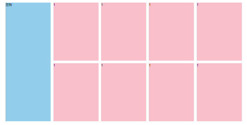
```
//-------------demo-------------------
a,
b,
c {
width: 200px;
height: 200px;
float: left;
}
<div class="a"></div>
<div class="b"></div>
<div class="c"></div>
```
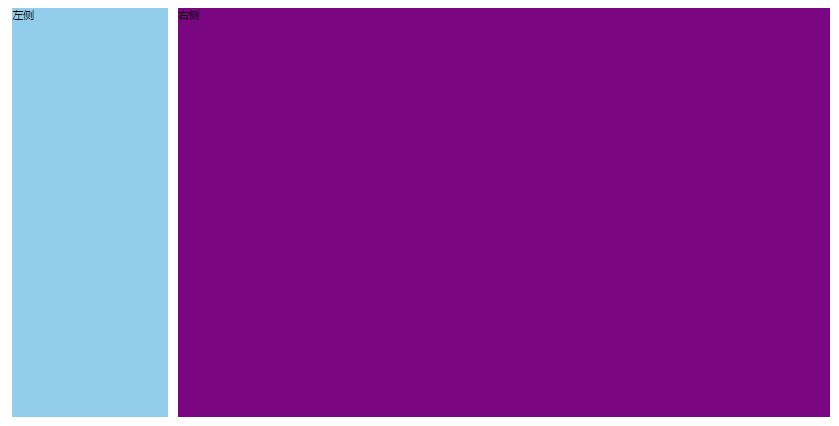
## 清除浮动
场景:浮动元素会脱标,如果**父级没有高度**,**子级无法撑开父级高度**(可能导致页面布局错乱)
解决方法:**清除浮动**(清除浮动带来的影响)
#### 场景搭建
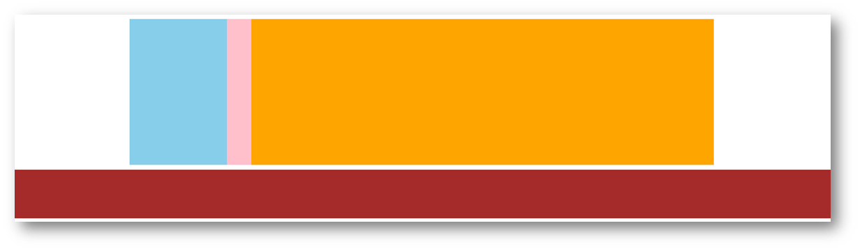
```
<style>
.top {
margin: 10px auto;
width: 1200px;
/* height: 300px; */
background-color: pink;
}
.left {
float: left;
width: 200px;
height: 300px;
background-color: skyblue;
}
.right {
float: right;
width: 950px;
height: 300px;
background-color: orange;
}
.bottom {
height: 100px;
background-color: brown;
}
</style>
<div class="top">
<div class="left"></div>
<div class="right"></div>
</div>
<div class="bottom"></div>
```
### 额外标签法
在**父元素内容的最后**添加一个**块级**元素,设置 CSS 属性 **clear: both**
```
<style>
.clearfix {
clear: both; // 两侧
clear: left; // 左
clear: right; // 右
}
</style>
<div class="father">
<div class="left"></div>
<div class="right"></div>
<div class="clearfix"></div>
</div>
```
### 单伪元素法
1. 准备 after 伪元素
```
.clearfix::after {
content: "";
display: block;
clear: both;
}
```
2. 父级使用 clearfix 类
`<div class="clearfix"></div>`
### 双伪元素法
1.准备 after 和 before 伪元素
```
/* before 解决外边距塌陷问题 */
/* 双伪元素法 */
.clearfix::before,
.clearfix::after {
content: "";
display: table;
}
/* after 清除浮动 */
.clearfix::after {
clear: both;
}
```
2.父级使用 clearfix 类
`<div class="father clearfix"></div>`
### overfow法
```
.father {
margin: 10px auto;
width: 1200px;
/* height: 300px; */
background-color: pink;
overflow: hidden;
}
```
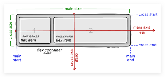
## Flex布局
设置方式:给**父**元素设置 **display: flex**,子元素可以自动挤压或拉伸
组成部分:
* 弹性容器
* 弹性盒子
* 主轴:默认在**水平**方向
* 侧轴 / 交叉轴:默认在**垂直**方向
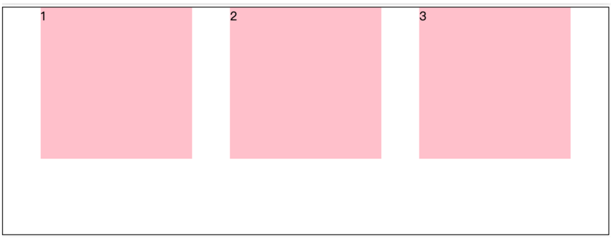
### 主轴对齐方式
属性名:**justify-content**
| **属性** | 效果 |
| ----------------- | ------------------- |
| flex-start | 默认值,弹性盒子从起点开始依次排列 |
| flex-end | 弹性盒子从终点开始依次排列 |
| center | 弹性盒子沿主轴居中排列 |
| space-between | 弹性盒子沿主轴均匀排列,空白间距均分在弹性盒子之间 |
| space-around | 弹性盒子沿主轴均匀排列,空白间距均分在弹性盒子两侧 |
| space-evenly | 弹性盒子沿主轴均匀排列,弹性盒子与容器之间间距相等 |
重点记住标红的。如果非要问我那个常用,我只能说是 `space-between `
```css
justify-content: space-between;
```
显示效果:**两侧没缝隙**
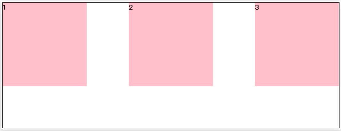
```css
justify-content: space-around;
```
效果如下: **记住2倍**
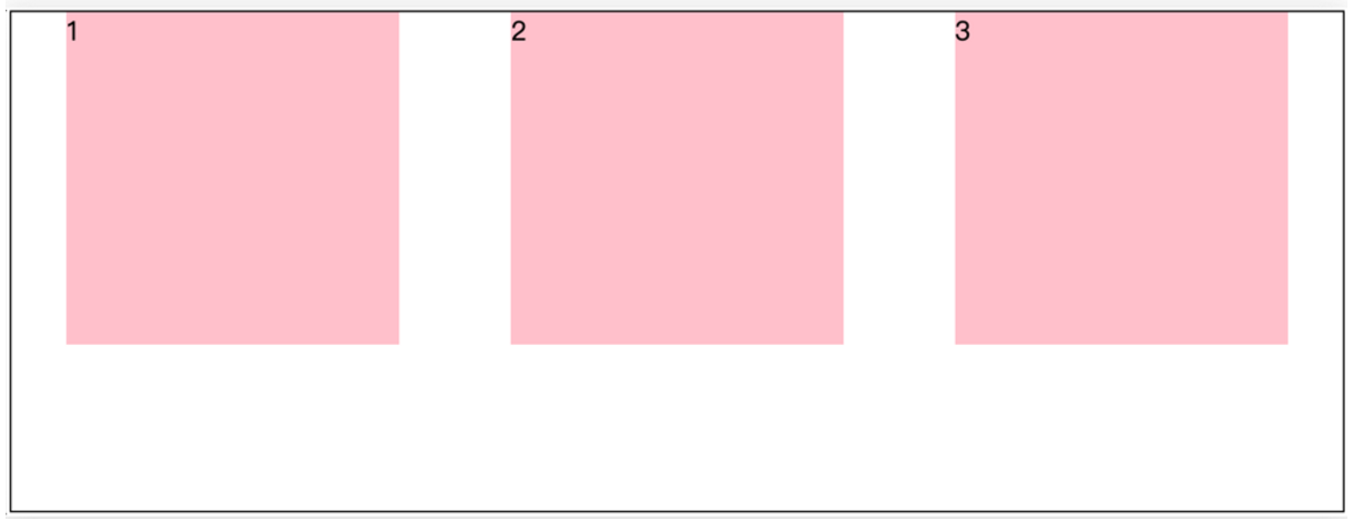
```css
justify-content: space-evenly;
```
效果如下: **记住空隙一样大**
```css
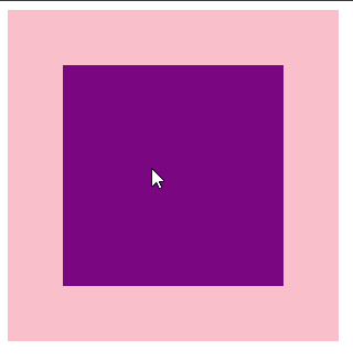
justify-content: center;
```
效果如下: **经常用于让一个盒子水平居中**
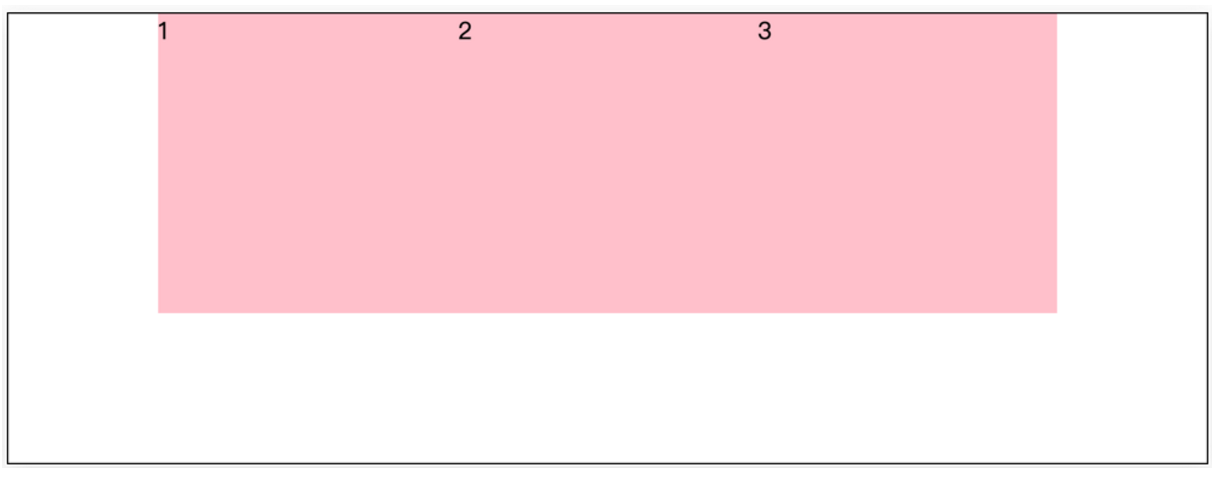
记忆:
1. `两侧没缝隙是 between`
2. 缝隙一样大是 evenly
3. 2倍缝隙是 around
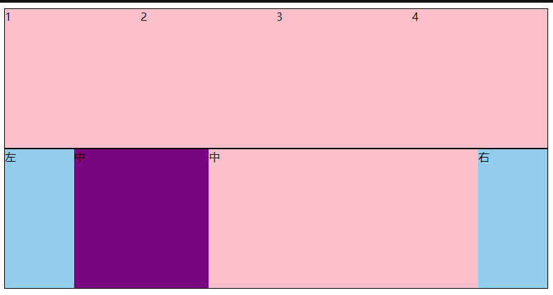
### 侧轴对齐方式
* align-items:当前弹性容器内**所有**弹性盒子的侧轴对齐方式(给**弹性容器**设置)
* align-self:单独控制**某个弹性盒子**的侧轴对齐方式(给**弹性盒子**设置)
| **属性** | 效果 |
| ----------------- | ------------------- |
| stretch | 弹性盒子沿着侧轴线被拉伸至铺满容器(弹性盒子没有设置侧轴方向尺寸则默认拉伸) |
| center | 弹性盒子沿侧轴居中排列 |
| flex-start | 弹性盒子从起点开始依次排列 |
| flex-end | 弹性盒子从终点开始依次排列 |
### 盒子水平和垂直居中的写法
## 自动换行
弹性盒子可以自动挤压或拉伸,默认情况下,所有弹性盒子都在一行显示。
属性名:flex-wrap
属性值
•wrap:换行
•nowrap:不换行(默认)
## 行对齐方式
> 如果有多行侧轴对齐,则去找align-content
> 如果是单行侧轴对齐,则去找 align-items
属性名:align-content
属性值
| **属性** | 效果 |
| ----------------- | ------------------- |
| flex-start | 默认值,弹性盒子从起点开始依次排列 |
| flex-end | 弹性盒子从终点开始依次排列 |
| center | 弹性盒子沿主轴居中排列 |
| space-between | 弹性盒子沿主轴均匀排列,空白间距均分在弹性盒子之间 |
| space-around | 弹性盒子沿主轴均匀排列,空白间距均分在弹性盒子两侧 |
| space-evenly | 弹性盒子沿主轴均匀排列,弹性盒子与容器之间间距相等 |
> 注意:该属性对**单行**弹性盒子模型**无效**。
## 侧轴单行对齐
> 注意:该属性对**单行**子盒子**有效**。
属性名:align-self
属性值
## 修改主轴方向
> 为什么要修改主轴? 只要父亲添加了display: flex, 所有的子盒子都会一行显示(水平显示) →
> 但是, 我们很多情况下,需要 盒子垂直竖着显示,此时就需要把主轴修改一下。修改为 竖着 ↓
主轴默认在水平方向,侧轴默认在垂直方向**
属性名:**flex-direction**
属性值
| **属性** | 效果 |
| ----------------- | ------------------- |
| row | 水平方向,从左向右(默认) |
| column | 垂直方向,从上向下 |
| row-reverse | 水平方向,从右向左 |
| column-reverse | 垂直方向,从下向上 |
## 弹性伸缩比
作用:控制弹性盒子的主轴方向的尺寸。
属性名:**flex**
属性值:整数数字,表示占用**父级剩余尺寸的份数**
例子:flex:1;
## CSS属性书写顺序
先1后2后3后4
1. 布局定位属性:`display / position / float / clear / visibility / overflow(建议 display 第一个写,毕竟关系到模式)`
2. 自身属性:`width / height / margin / padding / border / background`
3. 文本属性:`color / font / text-decoration / text-align / vertical-align / white- space / break-word`
4. 其他属性(CSS3):`content / cursor / border-radius / box-shadow / text-shadow / background:linear-gradient`
## 定位(position)主要包括:定位模式和边偏移两部分
1、边偏移
分为:上(top)下(bottom)左(left)右(right)
2、定位模式
static 自动定位(默认什么也没有)
relative 相对定位,相对于其原文档流的位置进行定位,移动后还占有原有位置,以自己基准点移动
absolute 绝对定位,相对于其上一个已经定位的父元素进行定位,移动后不占位置,以窗口基准点移动
### 相对定位
**position: relative**
特点:
* 不脱标,占用自己原来位置
* 显示模式特点保持不变
* 设置边偏移则相对自己原来位置移动
> 拓展:很少单独使用相对定位,一般是与其他定位方式配合使用
```
div {
position: relative;
top: 100px;
left: 200px;
}
```
### 绝对定位
**position: absolute**
使用场景:子级绝对定位,父级相对定位(**子绝对父相对**)
特点:
* 脱标,不占位
* 显示模式具备行内块特点
* 设置边偏移则相对最近的已经定位的祖先元素改变位置
* 如果祖先元素都未定位,则相对浏览器可视区改变位置
```
.father {
position: relative;
}
.father span {
position: absolute;
top: 0;
right: 0;
}
```
### 定位居中
实现步骤:
1. 绝对定位
2. 水平、垂直边偏移为 50%
3. 子级向左、上移动自身尺寸的一半
* 左、上的外边距为 –尺寸的一半
* transform: translate(-50%, -50%) // 左 上 移动自身50%
```
<!DOCTYPE html>
<html lang="en">
<head>
<meta charset="UTF-8">
<meta http-equiv="X-UA-Compatible" content="IE=edge">
<meta name="viewport" content="width=device-width, initial-scale=1.0">
<title>Document</title>
<style>
/* 让绝对定位的盒子水平和垂直居中 */
.box {
position: absolute;
/* 移动父亲的50% */
left: 50%;
/* 往左走自己宽度的一半 */
/* margin-left: -100px; */
top: 50%;
/* margin-top: -100px; */
/* 让子盒子走自己宽度和高度的一半 */
transform: translate(-50%, -50%);
width: 200px;
height: 200px;
background-color: pink;
/* 绝对定位让margin 0 auto 失效 */
/* margin: 0 auto; */
}
img {
position: absolute;
top: 50%;
left: 50%;
/* 让子盒子走自己宽度和高度的一半 */
transform: translate(-50%, -50%);
/* 注意,translate 百分比相对于盒子自身的宽度和高度来说 */
}
</style>
</head>
<body>
<!-- <div class="box"></div> -->
<img src="./images/down-open.png" alt="">
</body>
</html>
```
### 固定定位
**position: fixed**
场景:元素的位置在网页滚动时不会改变,例如:淘宝侧边栏
特点:
* 脱标,不占位
* 显示模式具备行内块特点
* 设置边偏移相对浏览器窗口改变位置
```
<!DOCTYPE html>
<html lang="en">
<head>
<meta charset="UTF-8">
<meta http-equiv="X-UA-Compatible" content="IE=edge">
<meta name="viewport" content="width=device-width, initial-scale=1.0">
<title>Document</title>
<style>
.header {
position: fixed;
left: 0;
top: 0;
/* width: 200px; */
width: 100%;
height: 80px;
background-color: pink;
}
</style>
</head>
<body>
<div class="header">123</div>
<p> 里面有很多的文字</p>
<p> 里面有很多的文字</p>
<p> 里面有很多的文字</p>
<p> 里面有很多的文字</p>
<p> 里面有很多的文字</p>
<p> 里面有很多的文字</p>
<p> 里面有很多的文字</p>
<p> 里面有很多的文字</p>
</body>
</html>
```
### 堆叠层级z-index

默认效果:按照标签书写顺序,后来者居上
作用:设置定位元素的层级顺序,改变定位元素的显示顺序
属性名:**z-index**
属性值:**整数数字**(默认值为auto,取值越大,层级越高)
```
<!DOCTYPE html>
<html lang="en">
<head>
<meta charset="UTF-8">
<meta http-equiv="X-UA-Compatible" content="IE=edge">
<meta name="viewport" content="width=device-width, initial-scale=1.0">
<title>Document</title>
<style>
div {
position: absolute;
top: 0;
left: 0;
/* 默认的层级 z-index: auto; */
/* 根据标签的书写顺序排列 */
/* 越往后,层级越高 */
width: 200px;
height: 200px;
}
.box1 {
background-color: red;
/* 层级属性 整数 不要跟单位*/
/* 数字越大,层级越高 */
z-index: 1;
}
.box2 {
background-color: green;
left: 20px;
top: 20px;
z-index: 2;
}
.box3 {
background-color: blue;
left: 40px;
top: 40px;
}
</style>
</head>
<body>
<div class="box1"></div>
<div class="box2"></div>
<div class="box3"></div>
</body>
</html>
```
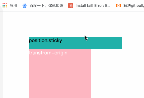
### 粘性定位
**position: sticky**
使用场景:
特点:
* 不脱标,占位
* 当元素在区域内,元素不受定位的影响(top、left等设置无效)
* 当发生滚动,元素就要移出区域时,定位又会变成fixed,根据设置的left、top的值进行定位,像是fixed效果