CSS
## 元素显示与隐藏
| **display属性** | 说明:不占位置 |
| ----------------- | ------------------- |
| none | 隐藏某个元素 |
| block | 显示某个元素 |
| **visibility属性** | 说明:占位置 |
| ----------------- | ------------------- |
| hidden | 隐藏某个元素 |
| visible | 显示某个元素 |
| **overflow属性** | 说明 |
| ----------------- | ------------------- |
| hidden | 溢出隐藏 |
| visible | 默认显示效果 |
| scroll | 溢出滚动(无论是否溢出,都显示滚动条位置) |
| auto | 溢出滚动(溢出才显示滚动条位置) |
## 多图层进行调用
```
<div class="box">
<a href="#">
<div class="hidden">
<img src="20201018/images/arr.png">
</div>
<img class="tu" src="20201018/images/3.jpg">
</a>
</div>
a:hover .hidden{ // 鼠标经过a的时候,a里面的hidden进行显示
display:block;
}
```
## 轮廓(outline)
在输入框选中时,四周的线就是轮廓线 outline:none就是无边框
outline-color 颜色
outline-style 样式 none无边框 dotted点线边框 dashed虚线边框 solid实线边框 double双线边框
outline-width 宽度
## 防止拖拽文本域(resize)
| **resize属性** | 说明 |
| ----------------- | ------------------- |
| none | 不允许设置文本域大小 |
| both | 用户可以设置高和宽 |
| horizontal | 可以设置宽度 |
| vertical | 可以设置高度 |
## 垂直对齐方式(vertical-align)
| **vertical-align属性** | 说明 |
| ----------------- | ------------------- |
| baseline | 让文字和图片基线对齐 |
| middle | 让文字和图片垂直居中 |
| top | 让文字和图片顶部对齐 |
| bottom | 让文字和图片底部对齐 |
如果控件带有边框,图片撑开边框,那只要让图片垂直居中对齐,即可解决
## 过渡
作用:可以为一个元素在不同状态之间切换的时候添加**过渡效果**
属性名:**transition(复合属性)**
属性值:**过渡的属性 花费时间 (s)**
提示:
* 过渡的属性可以是具体的 CSS 属性
* 也可以为 all(两个状态属性值不同的所有属性,都产生过渡效果)
* transition 设置给元素本身
```
<!DOCTYPE html>
<html lang="en">
<head>
<meta charset="UTF-8">
<meta http-equiv="X-UA-Compatible" content="IE=edge">
<meta name="viewport" content="width=device-width, initial-scale=1.0">
<title>Document</title>
<style>
.box {
width: 200px;
height: 200px;
background-color: pink;
/* 谁做过渡给谁加 */
transition: all .3s;
}
.box:hover {
height: 300px;
width: 300px;
background-color: green;
}
input {
width: 200px;
height: 30px;
transition: all .3s;
}
/* 当表单得到光标的时候 */
input:focus {
width: 300px;
background-color: pink;
}
</style>
</head>
<body>
<div class="box"></div>
<input type="text">
</body>
</html>
```
## 表单获得焦点选择器 focus
```
/* 当表单得到光标的时候 */
input:focus {
width: 300px;
background-color: pink;
}
```
## 透明度opacity
作用:设置**整个元素的透明度**(包含背景和内容)
属性名:opacity
属性值:0 – 1
* 0:完全透明(元素不可见)
* 1:不透明
* 0-1之间小数:半透明
```
<!DOCTYPE html>
<html lang="en">
<head>
<meta charset="UTF-8">
<meta http-equiv="X-UA-Compatible" content="IE=edge">
<meta name="viewport" content="width=device-width, initial-scale=1.0">
<title>Document</title>
<style>
body {
background: url(./images/huawei.jpg);
}
.box1 {
width: 200px;
height: 200px;
background-color: pink;
/*1. 盒子包括内容都是半透明 */
/* 0 是完全透明 */
/* 1 是完全不透明 */
opacity: 0.2;
}
.box2 {
width: 200px;
height: 200px;
/*2. 背景半透明只是盒子背景透明,而里面的内容不透明 */
background-color: rgba(0, 0, 0, 0.3);
color: #fff;
}
</style>
</head>
<body>
<div class="box1">
里面的文字也会半透明
</div>
<div class="box2">
里面的文字不半透明
</div>
</body>
</html>
```
## 光标类型cursor
作用:鼠标悬停在元素上时指针显示样式
属性名:cursor
| **cursor属性** | 说明 |
| ----------------- | ------------------- |
| default | 默认值,通常是箭头 |
| pointer | 小手效果,提示用户可以点击 |
| text | 工字型,提示用户可以选择文字 |
| move | 十字光标,提示用户可以移动 |
```
<!DOCTYPE html>
<html lang="en">
<head>
<meta charset="UTF-8">
<meta http-equiv="X-UA-Compatible" content="IE=edge">
<meta name="viewport" content="width=device-width, initial-scale=1.0">
<title>Document</title>
<style>
div:nth-child(1) {
cursor: default;
}
div:nth-child(2) {
/* 小手 */
cursor: pointer;
}
div:nth-child(3) {
/* 文本 */
cursor: text;
}
div:nth-child(4) {
/* 移动 */
cursor: move;
}
div:nth-child(5) {
/* 禁止 */
cursor: not-allowed;
}
button {
cursor: pointer;
}
</style>
</head>
<body>
<div>鼠标默认</div>
<div>鼠标小手</div>
<div>鼠标选择文本</div>
<div>鼠标移动</div>
<div>鼠标禁止</div>
<button>注册</button>
</body>
</html>
```
## 禁用鼠标样式
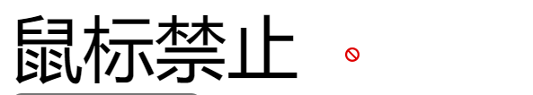
```
div:nth-child(5) {
/* 禁止 */
cursor: not-allowed;
}
```
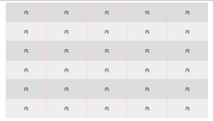
## 表格样式-合并相邻两个边框
```
<!DOCTYPE html>
<html lang="en">
<head>
<meta charset="UTF-8">
<meta http-equiv="X-UA-Compatible" content="IE=edge">
<meta name="viewport" content="width=device-width, initial-scale=1.0">
<title>Document</title>
<style>
table {
width: 700px;
height: 400px;
margin: 0 auto;
text-align: center;
}
table,
tr,
td {
border: 1px solid pink;
/* 合并相邻的两个边框 */
border-collapse: collapse;
}
/* 2n 偶数 / even */
/* tr:nth-child(2n) {
background-color: #eee;
} */
tr:nth-child(even) {
background-color: #eee;
}
/* 2n+1 奇数 odd */
tr:nth-child(odd) {
background-color: #ddd;
}
</style>
</head>
<body>
<table>
<tr>
<td>内</td>
<td>内</td>
<td>内</td>
<td>内</td>
<td>内</td>
</tr>
<tr>
<td>内</td>
<td>内</td>
<td>内</td>
<td>内</td>
<td>内</td>
</tr>
<tr>
<td>内</td>
<td>内</td>
<td>内</td>
<td>内</td>
<td>内</td>
</tr>
<tr>
<td>内</td>
<td>内</td>
<td>内</td>
<td>内</td>
<td>内</td>
</tr>
<tr>
<td>内</td>
<td>内</td>
<td>内</td>
<td>内</td>
<td>内</td>
</tr>
<tr>
<td>内</td>
<td>内</td>
<td>内</td>
<td>内</td>
<td>内</td>
</tr>
</table>
</body>
</html>
```
## 溢出的文字隐藏(white-space)
white-space 设置检索对象内的文本的显示方式
超出文字以省略号显示的方法
属性名:white-space
| **white-space属性** | 说明 |
| ----------------- | ------------------- |
| nowrap | 文本不会换行,文本会在在同一行上显示所有文本 |
属性名:overflow
| **overflow属性** | 说明 |
| ----------------- | ------------------- |
| hidden | 隐藏溢出的文字 |
属性名:text-overflow
| **text-overflow属性** | 说明 |
| ----------------- | ------------------- |
| clip | 不显示省略标记(...),而是简单的裁切 |
| ellipsis | 当对象内文本溢出时显示省略标记(...) |
>d 直接复制以下代码,溢出文字不显示省略号
```
// 这是一套代码
white-space:nowrap;
overflow:hidden;
text-overflow:clip;
```
1、文字一行显示不换行 white-space:nowrap;
2、溢出部分隐藏 overflow:hidden;
3、超出的部分以省略号显示 text-overflow:ellipsis;
## CSS精灵技术 (sprite)
CSS 精灵,也叫 **CSS Sprites**,是一种网页**图片应用处理方式**。把网页中**一些背景图片**整合到**一张图片**文件中,再**background-position** 精确的定位出背景图片的位置。
优点:减少服务器被请求次数,减轻服务器的压力,提高页面加载速度
实现步骤:
1. 创建盒子,**盒子尺寸**与**小图**尺寸**相同**
2. 设置盒子**背景图**为精灵图
3. 添加 **background-position** 属性,改变**背景图位置**
3.1 使用 PxCook 测量小图片**左上角坐标**
3.2 取**负数**坐标为 background-position 属性值(向左上移动图片位置)
案例-写出自己的名字
```
<!DOCTYPE html>
<html lang="en">
<head>
<meta charset="UTF-8">
<meta http-equiv="X-UA-Compatible" content="IE=edge">
<meta name="viewport" content="width=device-width, initial-scale=1.0">
<title>Document</title>
<style>
div {
display: inline-block;
margin: 0 15px;
background: url(./images/abcd.jpg) no-repeat;
}
.l {
width: 96px;
height: 112px;
background-color: pink;
background-position: -5px -275px;
}
.i {
width: 62px;
height: 107px;
background-position: -324px -141px;
}
.u {
width: 112px;
height: 112px;
background-position: -476px -421px;
}
span {
display: block;
width: 106px;
height: 118px;
background: url(./images/abcd.jpg) no-repeat;
/* 过渡 */
transition: .2s;
}
span:hover {
/* background-position: -118px -12px; */
background-position: -484px -10px;
/* width: 95px; */
/* background-position: -3px -137px; */
}
</style>
</head>
<body>
<div class="l"></div>
<div class="i"></div>
<div class="u"></div>
<span></span>
</body>
</html>
```
精灵图就是通过背景图,切换位置,让一张图里面的多张小图,进行显示,精灵图的坐标一般都是负值
background的使用方式一样
```
地址 不平铺 X Y向下是负值
background: url(url) no-repeat 0 -100px;
```
滑动门 左右两张背景图拼接,即为滑动门
## 边框重叠线,解决方法
float:left; // 即可解决重叠之间的粗线
margin-left:-1px;
margin-top: -1px;
// 如果重叠引起的缺边,压住的解决方法
position:relative;
## CSS制作三角形
```
p {
width:0;
height:0;
border-style:solid;
border-width:10px;
border-color:red transparent transparent transparent;
// 修改颜色来转变方向
}
<p> </p>
```
## 字体引入到HTML
第一步:引入字体CSS到HTML
```
<link rel="stylesheet" href="./fonts/iconfont.css">
```
第二步:给盒子使用字体
```
<i class="iconfont 图标css名称"></i>
<i class="iconfont icon-search"></i>
```
## 引入ico图标 网页标签的小图标
### 网站图标
```
<link rel="shortcut icon" href="favicon.ico" type="image/x-icon"/>
```
favicon.ico 放到根目录里面
### 网站标题(title)
```
<title>小兔鲜</title>
```
### 网站说明(Description)
```
<meta name="description" content="网站介绍内容"/>
```
### 网站关键词(Keywords)
不要超过120个汉字,用英文逗号分隔,
Keywords 网站关键词 跟Description用法相似,一般6-8个关键词
```
<meta name="keywords" content="HTML,CSS,JavaScript">
```
## css变量
```
<!DOCTYPE html>
<html lang="en">
<head>
<meta charset="UTF-8">
<meta http-equiv="X-UA-Compatible" content="IE=edge">
<meta name="viewport" content="width=device-width, initial-scale=1.0">
<title>Document</title>
<style>
/* 1. 声明变量 */
:root {
--myColor: blue;
}
/* 2. 使用变量 */
.box {
color: var(--myColor);
}
.box1 {
background-color: var(--myColor);
}
.box2 {
border: 1px solid var(--myColor);
}
</style>
</head>
<body>
<div class="box">文字</div>
<div class="box1">文字</div>
<div class="box2">文字</div>
</body>
</html>
```